Brand Identity
Thrift Tee Merch
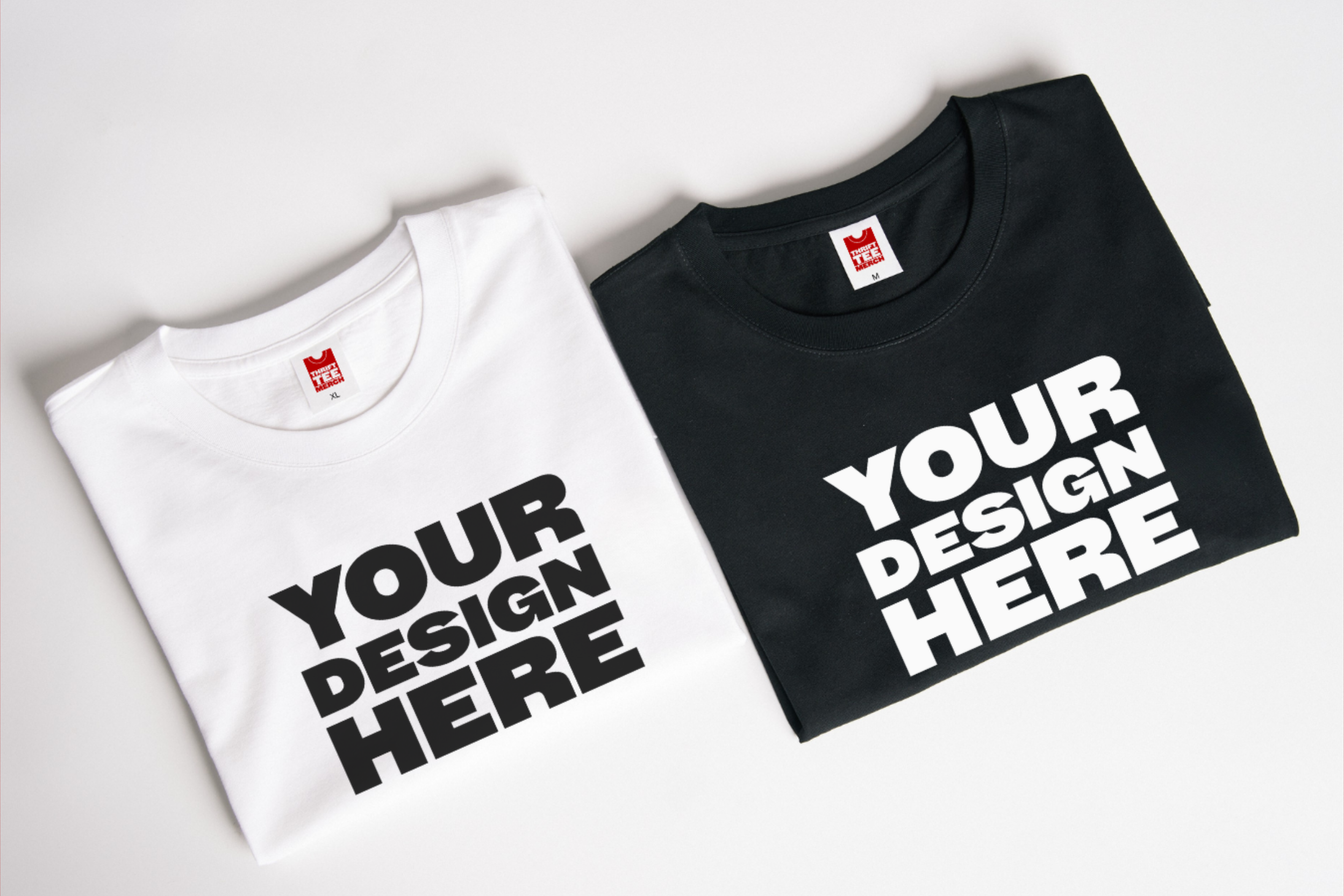
Thrift Tee Merch is a conceptual project which I created from one of my favourite things to do: up-cycle. Where merchandise is important for brand image and income, it also contributes to the ever-growing pile of clothing which already exists in the world. Therefore, TTM exists (conceptually).
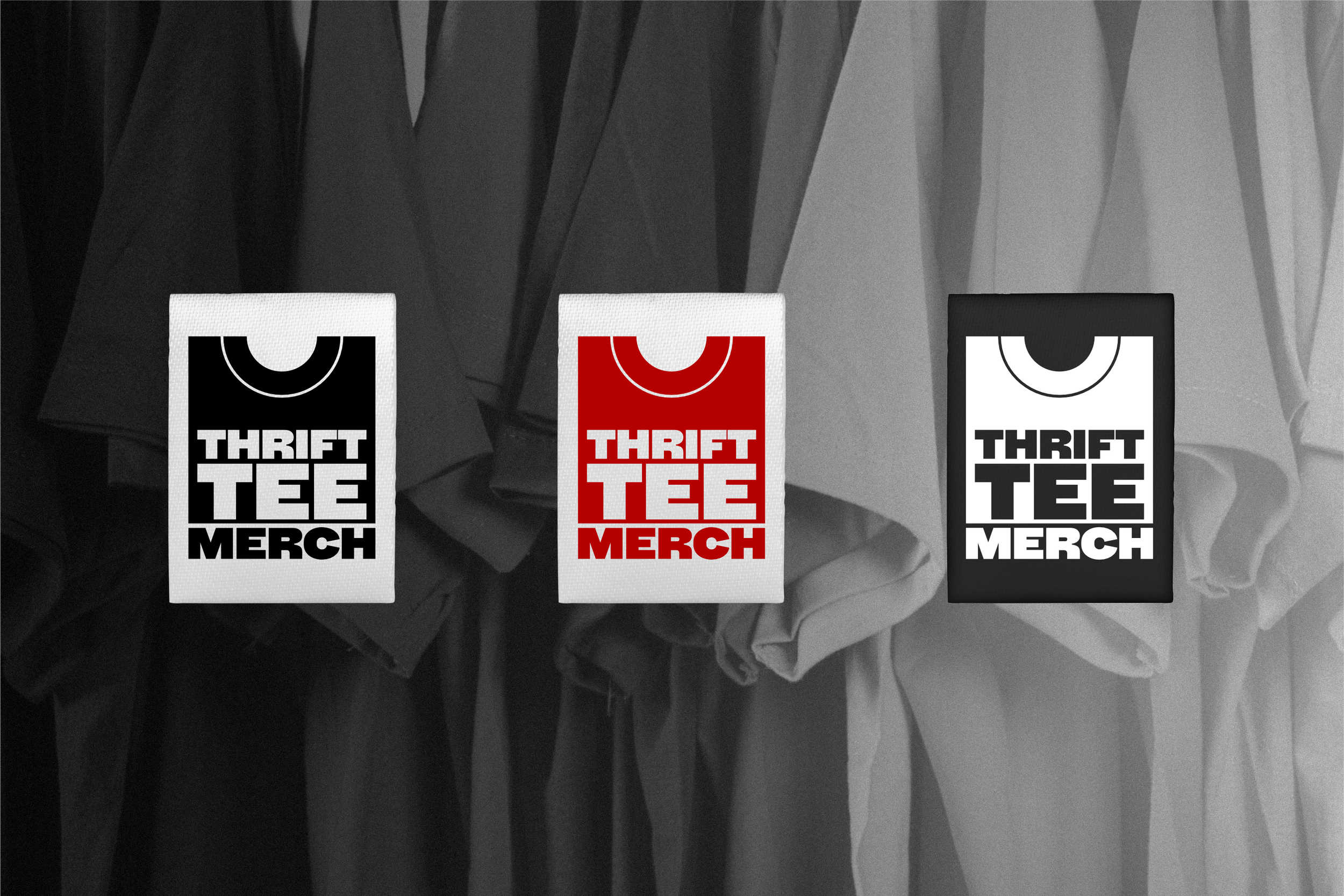
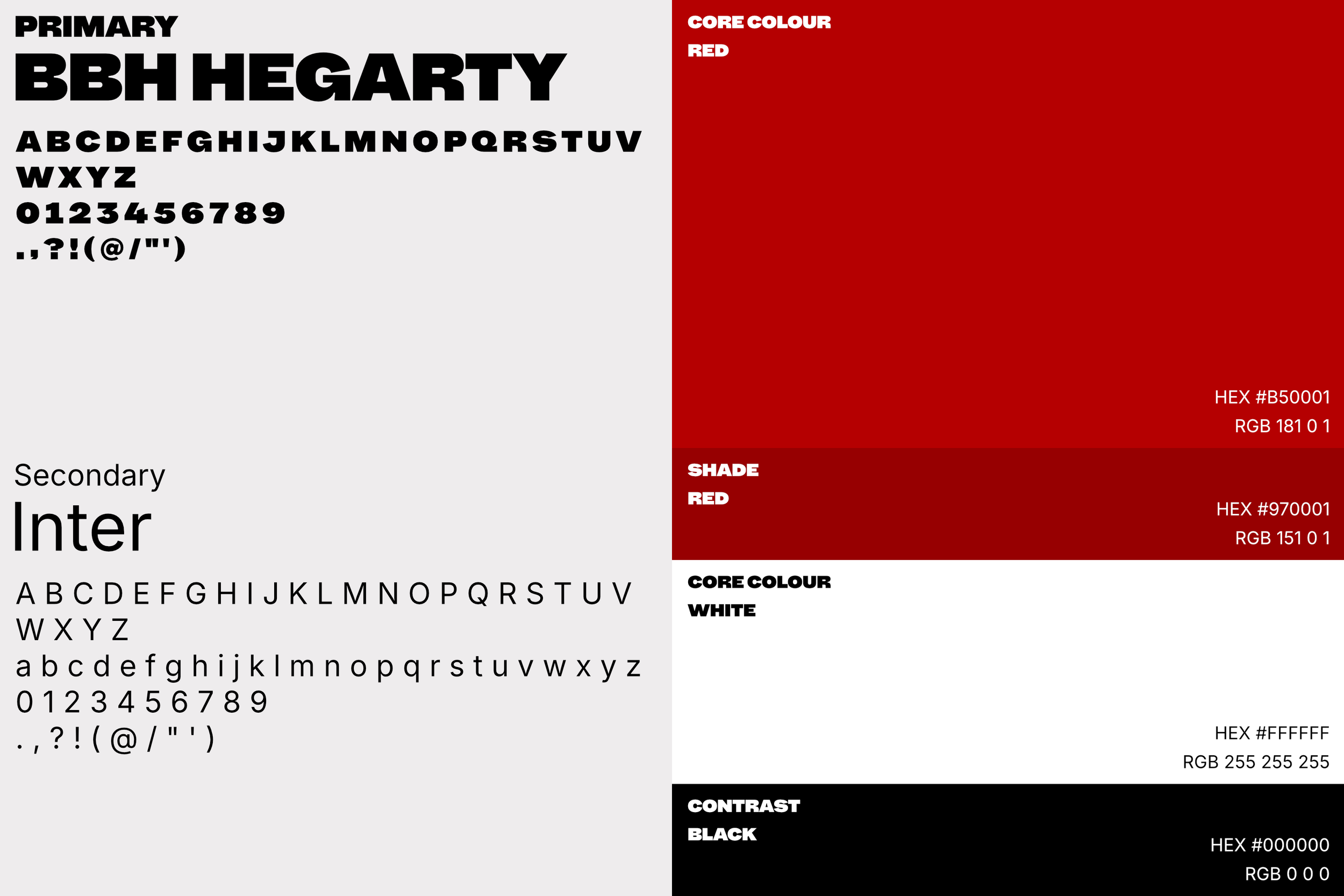
The red is intentional, bold and eye-catching, influenced by Depop (a well known second-hand marketplace) and Ali Express and AliBaba (bulk manufacturers). The black and white represents the two dominant colours for t-shirt merchandise, and most commonly found in second-hand stores.
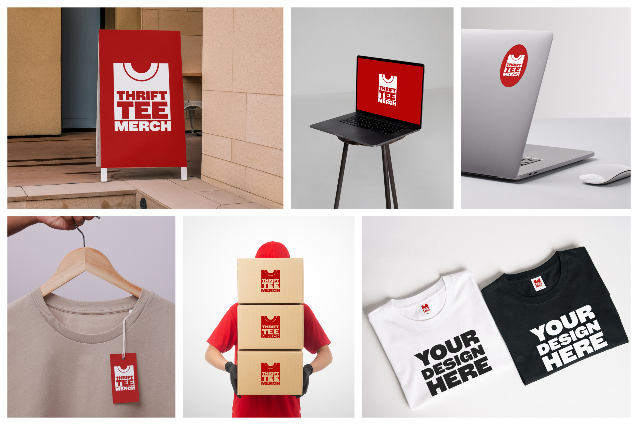
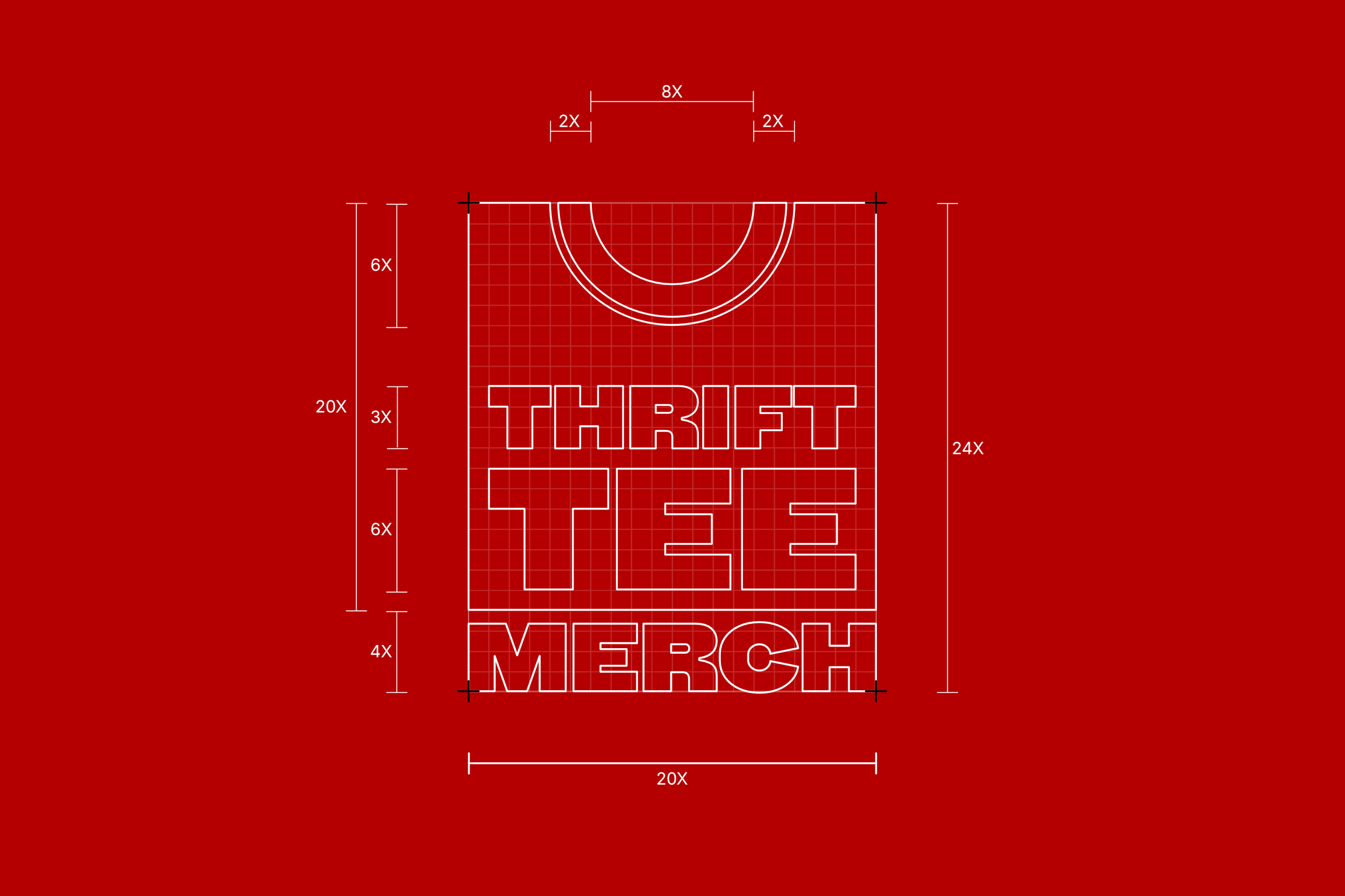
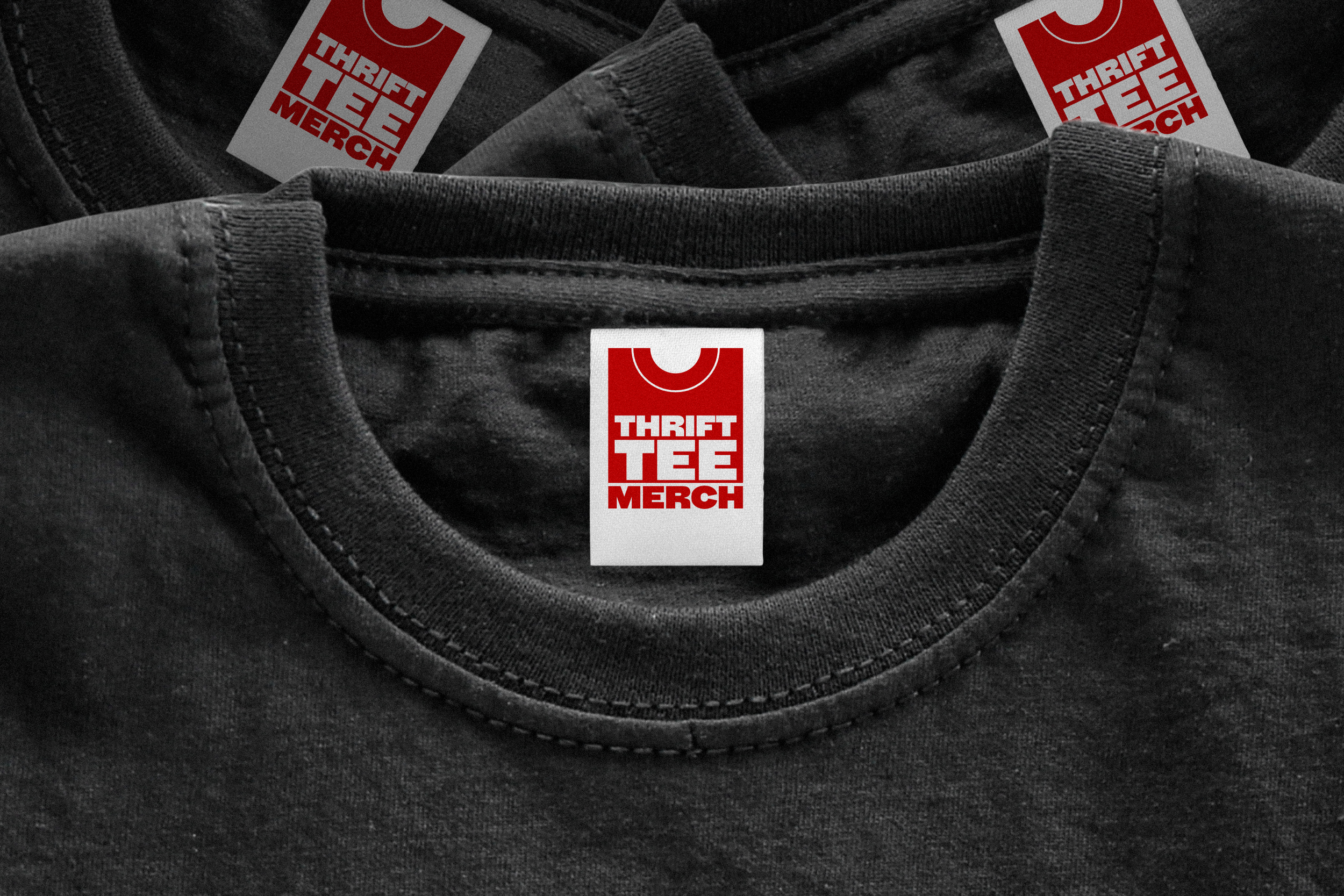
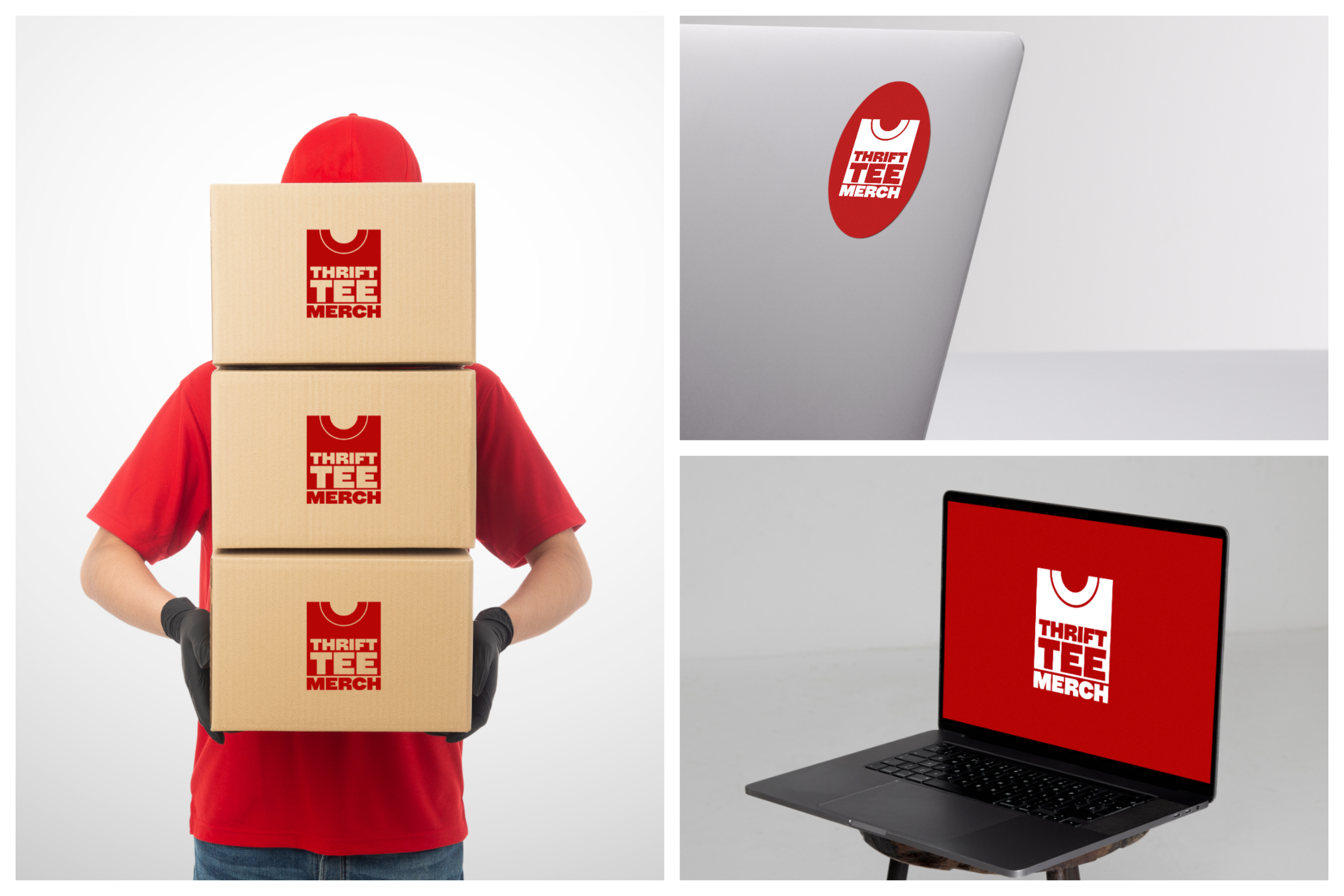
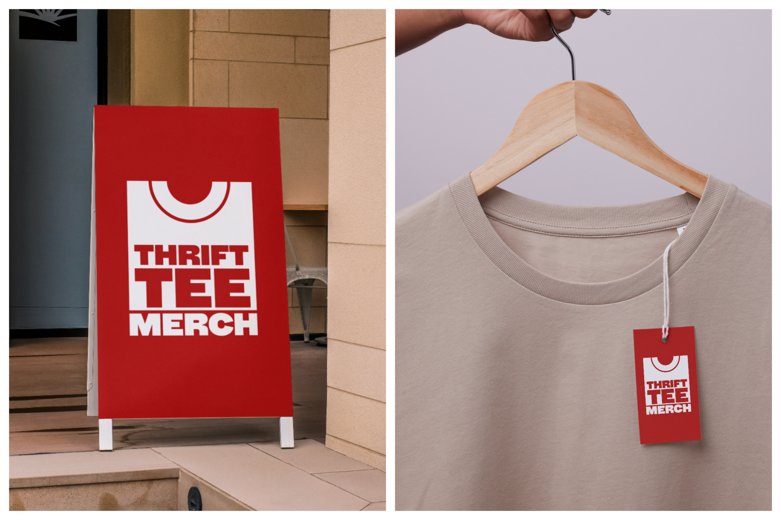
The logo itself is 5:6, fitting perfectly on a standard rectangular clothing label. It is designed to look like a folded t-shirt, and whilst the logo speaks for itself and what TTM is about, its design is based on emphasis. Similarly with the core colour red, the capitalisation of the font within the logo itself and overall brand is intended to stand out. Its competitors are huge brands producing on mass scale, and therefore TTM needs to be bold to catch eco-conscious businesses before bulk manufacturers do.